BidVertiser

25 May 2015

How to Create a Self-Portrait in a Geometric Style

How to Create a Self-Portrait in a Geometric Style

In this tutorial we’re going to talk about how to create an illustrated self-portrait in a geometric style. We’ll be using a photograph of ourselves as the base of the illustration, drawing a sketch from that, and then creating the final piece. Let’s get started!
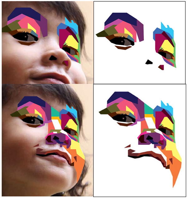
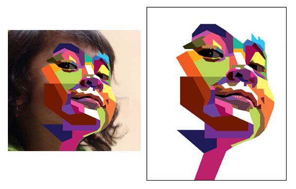
Since posting this tutorial, readers have been inspired to create their own self portraits in this style. Check out what they’ve achieved over on a special edition of Tuts+ Workshop: Created by You.
First, we take or select a photo. Because we're going for a symmetrical look, make sure you get a close up shot of your entire face and shoulders. In this case I’m going to take a picture with my webcam. It's not necessary for it to be a perfect shot as this is just the base of our illustration.
Now, create a New Document (cmd+N or ctrl+N) in Adobe Illustrator with an artboard size of 600 x 480px.
We are going to organize the layers as follows:
  • The top layer is named “Draw”. This is were we’ll do our illustration.
  • Below the "Draw" layer is the "Sketch" layer.
  • Below that is the "Photo" where we are going place the photo we just took.
  • Finally the "Background" layer. In this layer draw a square the same size as the artboard (600 x 480px) and fill it in with a grey color, this in case you have to draw things in white or light colors.
Lock the "Background" and "Photo" layers.
In the "Sketch" layer, using the Blob Brush Tool (Shift + B), we draw our sketch using the photo as a guide. Try to do the lines straight and simplify as many details as you can. For example the hair, or in this case the glasses are like octagons, as geometry is the base of this style.
Now you can delete the "Photo" layer. Don't worry if your sketch is a little messy, this is just our guide for the self portrait.
Change the Opacity of the sketch to 30% and lock the "Sketch" layer.
Now, start drawing from back to front using the Pen Tool (P). With a 1pt Black Stroke Weight, start tracing the hair, using only straight lines.
For the t-shirt, just draw one half of it, then Copy (Cmd + C) and Paste in front (Cmd + F).
Use the Reflect Tool (O) and flip the path.
Select both paths and use the Pathfinder > Unite option. Almost everything in the illustration can be done this way: copying, reflecting and Unite.
Now, draw the neck of the shirt. This can be done with the Polygon Tool.
Then place the shapes at the base of the neck.
Use the same process with the head shape. Draw an octagon and then select the top nodes. Move them with the arrow keys and/or adjust with the Scale Tool.
The same shape can be duplicated and used for the face. Then use Pathfinder > Minus Front on another duplicate to trim the neck shape as shown below.
To add detail, you can use the shape you’ve already created. For instance, in the example below, to add detail to the neck you can duplicate the shape for the face and enlarge it. Then duplicate again the base shape of the neck and use Pathfinder > Intersect.
Add a little more detail to the illustration with the Pen Tool (P) and Shape Tools. Remember to take advantage of the shapes you have created previously and duplicate them to use with Pathfinder.
We’re going to leave the face until the end of the drawing process.
Press D, and your illustration should look something like the below. Rearrange the shapes if required.
I've needed to rearrange the shapes of the head and the front of my hair.
Now we’ll approach the face. Here we’re going to apply all the techniques we’ve already used—like the use of the Pathfinder, Scale Tool, Reflect Tool, etc.
Let's begin.
To create the lips, we can start with a hexagon. Pull the side nodes and use the Scale Tool to modify the shape. Then draw a triangle and align it to the center.
Use Pathfinder > Minus Front to remove the triangle from the top of the lip.
Then Copy and Paste in Front the lips and scale the shape to the middle to create the parting in the lips. Modify the nodes at the top sides of the lips with the Direct Selection Tool (A).
For the eyes, we begin with an octagon. Using the Eraser Tool (Shift + E), remove the lower section of the shape.
Then, Copy by moving the path with Shift + Alt keys to Copy the object while moving it downwards.
Duplicate the basic form and apply Minus Front in the Pathfinder. This is the shadow of the eye. Duplicate it further to create the eyelash.
To add more details, draw a little octagon for the iris and duplicate the basic form and transform it to make the lower eyelid.
Finally, add some details—and it's done!
Since the eyes are looking in the same direction, we can just duplicate one, move it over, and be done.
For the nose, we start with an octagon again.
First, modify some nodes and add some anchor points to get the base shape of the nose. Then draw some octagons and other simple shapes to add volume and detail. Remember to use the Pathfinder and Align to keep symmetry in the drawing.
The glasses are very simple. Just an octagon slightly modified, then Copy and Paste in Front and Scale to form detail. Then apply Minus Front with Pathfinder.
Finally duplicate and add detail to finish the glasses.
At this point, our illustration should look something like this.
We’re now going to generate our color palette.
First select your colors for light and shadows. Draw squares with fills of the colors you’re going to use for the different parts of the portrait. I've picked six colors, three are for the highlights and three are for shadows.
With the Blend Tool (W), first click on the light color and then on the darker color. The result will be a smooth blend between the two.
Go to Object > Blend > Blend Options and change the option to Specified Steps. Input the value "5" and click on OK.
Now select the blend and go to Object > Expand. Now you can use the colors and add them to the Swatch panel by selecting them and clicking on the New Color Group button.
You can also add a name and save the palette for future illustrations.
This is our color palette, for the eyes and details we just change the option of the Blend to Specific Steps of 2 instead of 5.
Now, we are going to draw a line down the center of our illustration. We select the hair and lock it with Cmd + 2. Then select the line and go to Object > Path > Divide Objects Below. This is going to cut all the paths that are behind that line.
With all the objects divided we can Unlock the hair by pressing Cmd + Alt + 2 and start to apply our colors!
I suggest placing your colors on the canvas, close to your art, so you can apply them with the Eyedropper Tool (I). Click to grab the color and then hold Alt and Click on the object to which you want to apply that color.
There's a side of highlights and a side of shadows. Try to play with the colors to give the illustration life. For example, in the skin in the side of highlights, you can use the first 3 colors for the base skin but in the nose, lips and eyes from the 3 to the 6 color.
In the shadow from 2 to 4 to the base color and 4 to 7 for the nose (the same goes for the clothes and hair).
To draw the beard and moustache, draw a small rectangle with the Rectangle Tool (M). Alt+Drag to copy the path and then press Cmd + D to repeat the last action. Group all and Align in to the center of the face shape.
Our self portrait is almost done.
Advertisement
To finish the illustration, you can add some details such as more shadows or little ears by adjusting some nodes, etc.
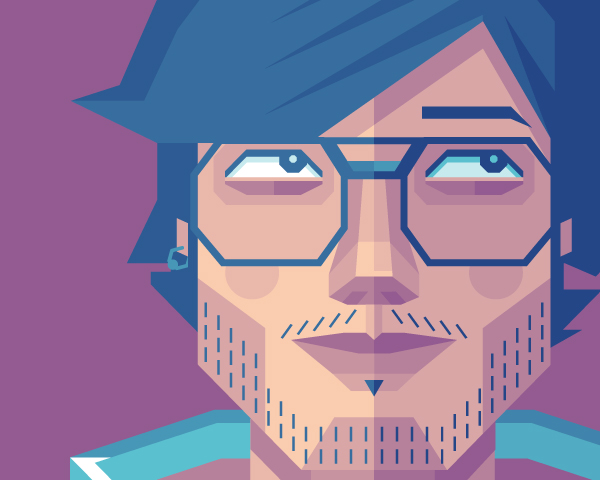
Our final illustration! I hope you have enjoyed this tutorial. If you do follow this tutorial and create your own self portrait, please post it in the comments so we can see your result. Saludos amigos!


How to Create a Geometric, WPAP Vector Portrait in Adobe Illustrator

How to Create a Geometric, WPAP Vector Portrait in Adobe Illustrator


Tuts+ has the honor to present to you a vector tutorial from a true legend, Wedha Abdul Rasyid.
Wedha, originally from Indonesia, created his art work in traditional mediums early in the 1990s, which later in early 2000, crossed over into the digital world. Vector being the natural choice for such a colorful, geometric style.
Since then, it has gained major popularity in Indonesia, with several communities dedicated to the creation and showcasing of portraits in a WPAP style, with members in their thousands! With the resurgence of the geometric trend, it's fair to say that WPAP may venture out of Indonesia and into more aspects of design.
The following is a tutorial on how to create a WPAP (Wedha's Pop Art Portrait) portrait in Adobe Illustrator, by the WPAP master himself!
WPAP's main goal is to represent the faces that are already familiar to us, with a new and different style, but it still must be easily recognizable. Different in a sense of being more unique, more dynamic, more striking and of course, more visually pleasing to see, I hope.
With that in mind, the WPAP creative process is based on two main processes; the faceting process and the coloring process. I do these two processes simultaneously when creating a new portrait.
In the faceting process, by tracing the image, I divide the human face into facets. Every facet (plane) is formed based on the different degrees of dark and bright areas seen on the original photo. Every facet is formed by straight lines, instead of curved lines. This is because facets that are formed by straight lines will appear stronger than a facet formed by curved lines.
Before we start the process, we should begin to see and assume the face of a human being as a shape that consists of many flat surfaces on a sphere, just like the ball in the below image. This is how best to describe the faceting process.
In coloring, to show something stronger, I only use flat colors, instead of a gradual colors. Although the colors look as if they collide with each other, effort should be made to make it look three-dimensional.
Creative experts will classify colors in groups. You have groups of hot colors, warm colors, cold colors. Think of them in terms of dark and light colors, ignoring the actual hue. Think more of colors in highlights, mid-tones and shadow. The differences in these groups make it possible for us to make a dimensional composition. No matter what color you choose, as long as you pick it from the right group, the result should work well in this format. Therefore it is important to experiment with color.
The faceting process is based on photo tracing. So the photo selection is important because a good photo in quality, image sharpness, lighting and resolution, will help you to create a good final rendering of a WPAP piece.
Aim for a photo that has even lighting and does not hit extremes, either in light or shadow. Also make sure that the image is sharp and in focus. For this tutorial I'm going to be creating a portrait of my beloved Grand Daughter, Ola.
Open Adobe Illustrator and create a New document (File > New). Set the size and other settings as shown below.
Go to File > Place and locate your reference image and place it on your artboard. Lock the layer the photo is contained in and then Create New Layer above the photo. This is where you'll be drawing your faceted shapes.
I usually start the tracing process by selecting an area with a definite boundary between the dark and bright areas. This is so I can easily do the tracing. And the smallest part usually becomes my first choice. In this case, the eyes and the surrounding areas.
Using the Rectangle Tool (M), I trace the highlight in the iris, that still seems vague in the photo. This shape has a fill with no stroke. All shapes created will be in this style.
In the original photograph, the iris, purple and eyelid edges have a dark color and it's clear to where you can define the edges of this shape. I will trace this section, this time I will use the Pen Tool (P).
Of course, the highlight you've drawn in the first step will now be hidden by the new layer. To make it visible, while the iris and eyelid still active, you will need to rearrange your shapes by going to Object > Arrange > Send to Back. At this stage, the "white" of the eye has a clear edge, so you can go ahead and create this shape to complete the eye. As easy as this is, it's about to get more difficult.
We will now trace the closest area next to the previous objects. Unfortunately, we have here no vivid and clear boundary between the dark and bright area. This makes it more difficult in creating the shapes for the portrait.
Facing such a case, intuitively, you have to be confident enough to determine the boundary for the shape. A solid grasp of the human face and a good image to work from can help a great deal here.
Create your straight edged shape along the corner of the eyelid, making sure you overlap the shapes for the eye so it doesn't leave any gaps between the shapes. Then as before, rearrange the shapes by going to Object > Arrange > Send to Back.
We come to the same problem for the next shape; no visible boundary for the shape. Again, with confidence you will need to create the shape. Notice how I've created a not-so-square shape and distorted the shape so it shows the darker shadow cast from the eyelashes. You will find similar shapes throughout which use this same method.
This is a problem you will come across over and over again. It may be a boring and tedious process, however it is the only way to create a proper WPAP composition. You may think of using Posterizing or Live Trace, but no, I don't use those facilities as they do not create the same style.
We are still going to find the unclear and even invisible boundaries for each potential shape. The best way to overcome this problem is through the experience of repeatedly creating artwork in this style.
The process is duplicated throughout:
  • Draw the shape with the Pen Tool (P) using only straight lines.
  • Fill with the appropriate color given it's exposure to light.
  • Select the shape and rearrange it by going to Object > Arrange > Send to Back.
All portraits will use a different series of shapes, so I can only show you the shapes I've drawn for Ola's portrait. I start by drawing further shapes around the eye area.
Then I work on the shapes for the other eye and nose. I then connect these areas with shapes and add white shapes for areas under extreme light.
I use larger shapes in the less detailed areas, such as the cheeks and neck.
The hair starts with thinner, parallel sided shapes on diagonals. Remember to avoid using curves at all costs.
As you can see, I love to make facets with vertical or horizontal sides. This will strengthen the overall composition and style. My priority is always facial resemblance, this is the most important element of the portrait.
After going through several revisions, this is my final artwork. Choosing the right color is the most difficult part in the process of WPAP. This can be a hard element to grasp when working with the style as a beginner.
If you're starting out, it will be easier if you paint it from the beginning with the grayscale tones, as you can clearly see which areas use dark and bright shapes. From there, you can build up the number of colors you introduce to the process, however it's not until you use a full color spectrum that you'll create a more striking portrait.
Advertisement
We can try to play with colors to create a different aesthetic. Try using Illustrator's Recolor Artwork feature to experiment with different combinations of colors.
We'd like to thank Wedha for his wonderful tutorial and insight into his unique style of rendering portraits. He's a great example of how a great traditional style of art can cross over perfectly to vector and have such an impact in our respective vector communities. We're left inspired!
Have you created a portrait in this style? If so, please share with us your creation!